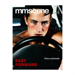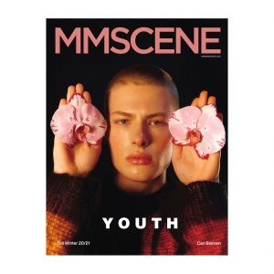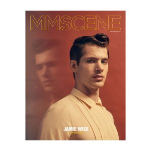

Fashion photography has always been about more than showcasing clothing. It communicates personality, atmosphere, and the creative vision behind a collection. In men’s fashion editorials, where styling often emphasizes structure, texture, and subtle details, color plays a particularly important role in shaping how an image is perceived.
From the muted tones of a minimalist studio portrait to the dramatic contrasts of an outdoor campaign, color influences the visual identity of every photograph. While lighting and composition establish the foundation of an image, thoughtful color grading helps bring its atmosphere together.
Understanding how color works throughout the photography process allows photographers to create more expressive images while maintaining the natural appearance of models and garments.
Why Color Matters in Men’s Fashion Photography
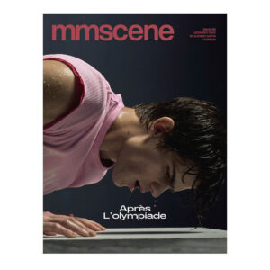
Color affects how viewers interpret fashion images before they consciously notice individual details. A photograph dominated by cool blue and gray tones may create a sophisticated, restrained atmosphere, while warm amber lighting can introduce a sense of nostalgia or intimacy. These associations influence the overall mood of an editorial and help communicate the designer’s intended message. Consider a campaign featuring tailored suits in a modern architectural setting. A subdued palette with controlled contrast can emphasize clean lines, sharp silhouettes, and the structure of the garments.
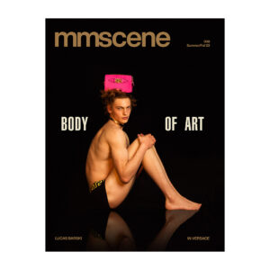
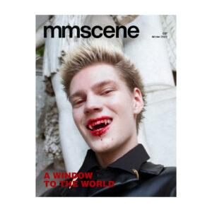
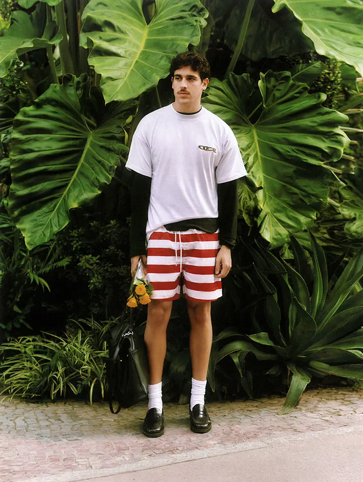
By comparison, a streetwear editorial photographed in an urban environment might benefit from vibrant colors, deeper shadows, and stronger contrasts that reflect the energy of the collection. The relationship between clothing and background colors is equally important. Neutral outfits may stand out against colorful surroundings, while monochromatic styling can create a cohesive, understated appearance.
However, effective color grading should support the fashion rather than overwhelm it. Excessive saturation or dramatic color shifts can distract viewers from the clothing and alter the appearance of important materials. The strongest fashion images maintain a balance between visual creativity and accurate representation.
Right Atmosphere Through Lighting
Successful color grading begins during the photoshoot itself. The quality, direction, and temperature of light determine how colors appear in the original image. Natural daylight offers a versatile starting point for fashion portraits, but its characteristics change throughout the day. Early morning and late afternoon light often produce warmer tones and softer shadows, creating an inviting atmosphere. Midday sunlight can generate stronger contrasts and more defined shadows, which may work well for dramatic editorial concepts.
Studio environments provide greater control over these variables. Photographers can combine softboxes, reflectors, and directional lighting to create a particular mood while keeping exposure and skin tones consistent. The choice of background also influences the final result. Dark backdrops can emphasize facial features and garment silhouettes, while lighter environments often create a cleaner, more contemporary aesthetic.
When planning a shoot, photographers should consider how these lighting decisions will translate into the final edited photographs. Capturing a balanced exposure and preserving detail in highlights and shadows provides greater flexibility during post-production.
Role of Color Grading in Creating a Consistent Editorial
An editorial typically includes multiple photographs featuring different poses, camera angles, and sometimes entirely different locations. Although each image should have its own character, the complete series must feel visually connected. This is where color grading becomes especially valuable. Color correction and color grading serve related but distinct purposes. Color correction focuses on achieving balanced exposure, accurate white balance, and realistic colors.
Color grading involves making creative adjustments that establish a particular aesthetic. For example, photographers might begin by correcting unwanted color casts caused by mixed lighting. They can then introduce subtle tonal adjustments to create a cooler, cinematic appearance or a warmer, vintage-inspired mood. Maintaining this consistency manually across a large collection can be challenging, particularly when lighting conditions vary between photographs.
A color grader that supports reference-based adjustments can help photographers establish a unified palette across different images, making it easier to maintain continuity while leaving room for individual creative decisions.
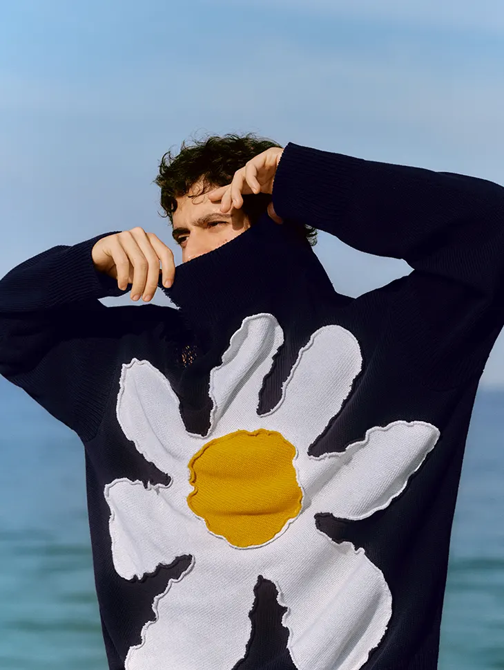
Reference images are particularly useful when an editorial requires a specific visual identity. Photographers can select an image that represents the intended atmosphere and use it as a starting point for adjustments throughout the series. However, automated corrections should always be reviewed carefully.
Differences in skin tone, background lighting, and garment colors may require additional refinements. A consistent editorial does not mean applying exactly the same settings to every photograph. Instead, it means maintaining a shared visual direction while respecting the characteristics of individual images.
Preserving Natural Skin Tones and Fabric Textures
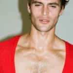
One of the greatest challenges in fashion photography is achieving a distinctive visual style without compromising realistic details. Skin tones are particularly sensitive to color adjustments. Changes in temperature, tint, or saturation can make a portrait appear unnatural, especially when strong creative filters are involved. For male modeling portraits, where facial structure and expression are often central to the composition, subtle processing tends to produce more convincing results.
Photographers should pay close attention to how adjustments affect highlights on the face, shadow transitions, and the natural variation of skin tones. Fabric textures require similar consideration. Different materials respond to light in unique ways. Wool absorbs and diffuses light differently from silk, while leather and metallic accessories can produce strong reflections. Aggressive color grading may obscure these characteristics or change the perceived shade of a garment. This becomes especially important in commercial fashion photography, where customers and creative teams expect clothing to be represented accurately.
A useful approach is to evaluate the photograph at different scales. Viewing the entire image helps assess its atmosphere and visual balance, while examining details at higher magnification reveals whether textures and colors have been preserved. The objective is to enhance the photograph without removing the qualities that make the clothing and model visually distinctive.
Developing a Recognizable Photography Style
Color grading can also contribute to a photographer’s professional identity. Successful fashion photographers often develop recognizable visual characteristics through their choices of lighting, composition, contrast, and color. Some favor understated tones and natural textures, while others build their work around bold palettes and experimental lighting. Developing a personal style does not require using the same color settings in every project. Instead, it involves understanding which visual elements communicate the photographer’s creative perspective and applying those principles consistently.
Experimentation remains essential. Photographers can explore different color combinations, study cinematic lighting techniques, and analyze editorial campaigns to understand how particular palettes influence the atmosphere of an image. Creating several interpretations of the same photograph can also help reveal how significantly color changes the viewer’s experience. A neutral portrait may communicate professionalism and restraint, while a darker version with stronger contrast could suggest mystery or intensity. Neither approach is inherently better. The appropriate choice depends on the intended story and the clothing being presented. Over time, this process helps photographers develop a more confident visual language.
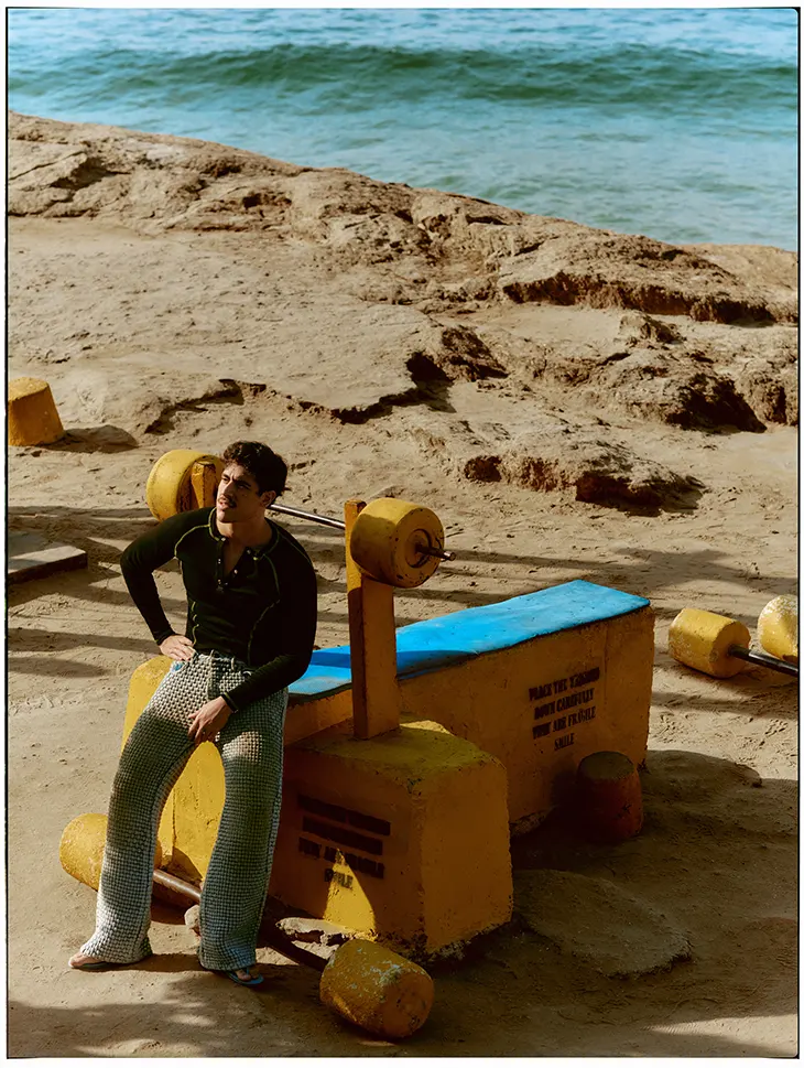
Preparing Images for Editorial and Digital Publication
The final appearance of a photograph also depends on where it will be published. Images intended for fashion magazines may require different preparation from photographs displayed on websites or social media platforms. Print production involves specific color-management requirements, while digital images must remain visually consistent across different screens and devices.
Photographers should consider these differences before exporting their work. Checking color profiles, reviewing contrast, and examining images on calibrated displays can help reduce unexpected changes in appearance. It is also useful to compare photographs as a complete editorial sequence rather than evaluating each frame independently. Transitions between images should feel deliberate. Sudden changes in white balance or saturation may interrupt the visual narrative, even when the individual photographs look attractive. A final review ensures that the collection maintains its intended atmosphere across different formats and viewing conditions.
Finally, color grading is an essential part of contemporary men’s fashion photography because it influences how clothing, models, and environments come together within a visual story. When combined with thoughtful lighting, careful composition, and an understanding of fabric textures, it allows photographers to create images that feel both expressive and cohesive. Modern editing techniques can make the process more efficient, but the most meaningful decisions remain creative ones. By treating color as a storytelling tool rather than simply a finishing effect, photographers can develop distinctive editorials that communicate the character of a collection while preserving the authenticity of every image.