Up until recently the perception was that women shop more than men. Most advertisements, especially in the beauty industry, were either created specifically with women in mind or directed at them. Nowadays, the trends are shifting and the gender gap appears to be closing when it comes to factors that affect purchases and shopping behavior. Now that males are a new demographic of consumers, a unique strategy is also necessary. What is effective for men? How can they be targeted by advertisements?
Packaging designers truly do differentiate between “feminine” packaging and “masculine” packaging, despite how clichéd it may look. And for good cause. When it comes to packing, each sex has a different set of interests and expectations.
Male consumers are quite picky about the packaging they want for beauty products, with American men being especially picky about masculine designs over unisex options.
Gender and Design
Consumer products also help define what is considered to be masculine, feminine, or even gender-neutral. The are a direct result of cultural gender norms. Although design can be thought of as a language, objects communicate in a different way than text.
The products typically have a close connection to both body care and bodily functions. The biological distinctions between men and women are depicted as scientific facts on certain packages. Other instances—like the packaging for perfume—showcase gender as multiple, fragmented, and flexible, disconnected from the body, and a fun aspect of identity. Such depictions illustrate the continually shifting nature of gender while simultaneously masking power disparities by making gender a question of customer preference. Processes that affect and change one another include gender and package design.
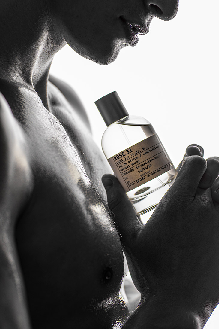
Many perfume brands that highlight the artistic nature of perfumery avoid making distinctions based on gender. They construct messages around memories, transitory experiences, sentiments, and places rather than gendered norms of attraction and sexuality. The packaging is frequently minimalistic with labels that have craft aesthetics on them to accommodate the variety of these options. Similarly, a gel polish manufacturer might focus on the artistry of nail design, creating products that appeal to diverse tastes without being confined to traditional gender expectations. Both industries emphasize creativity and personal expression over conventional labels.
This impression is further supported by the product information provided. As we examine more brands and items, a pattern emerges— the use of capital letters, large figures, and adjectives that allude to strength, performance, and power—becomes apparent.
Another recurring theme is references to fast vehicles that are typically operated by men, such as sports cars, spaceships, and more generally, anything that travels quickly.
The great divide
Men’s and women’s products come in very different wholesale cosmetic packaging designs, as you are undoubtedly already aware. An increasing number of businesses tailor their packaging for either men or women. The numerous options that customization can provide—including those for shape, design, color, typographies, logos, messages, and slogans—make this possible.
Shape
A product’s general design may already convey a strong message about whether it would appeal to men or women. Men often choose more geometric shapes like squares or straight lines, whereas women typically favor free-form, curved, or rounder shapes.
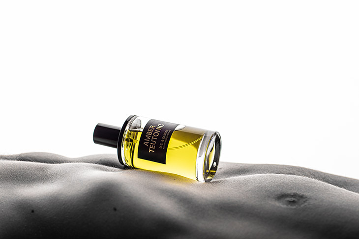
This issue is readily apparent in the cosmetics sector in items like colognes and scents. Men’s colognes typically use geometric shapes like squares or rectangles, but many women’s perfumes choose to use more curved designs as their packaging structure of choice.
Wholesale cosmetic packaging directed towards men often features rough textures that mimic vehicle tires. Because men must maintain control, even when taking a shower, grip.
Color
Men respond better to cool tones and achromatic hues like black and grey when it comes to color. On the other hand, women typically favor warmer colors. Women’s packaging, on the other hand, typically comes in white, pastel shades, or pink.
The most popular colors for cosmetic products, whether they be aftershave, deodorants, or fragrances for men, are still black and blues, despite the fact that many firms are now attempting to tackle cosmetic packaging and product marketing for men in a more modern approach. The majority of the sector is dominated by these masculine colors.
Graphics
In order to create cosmetic packaging that is particularly appealing to men, graphics, whether logos or additional graphics added to the product for informational or educational purposes, are also important. Men are drawn to plain images that concisely convey a product’s purpose and advantages without unnecessary embellishments or clutter.
Personalizing Products to attract male shoppers
The main problem is developing and customizing a packaging design that is specifically tailored to your company, even while many of the traits we identify with men and women stay true in their preferences for forms, colors, and graphics used in product design and packaging.
It presents a difficulty in and of itself to incorporate each of these features into a single packaging design. Companies striving to innovate in the fields of men’s personal care and cosmetics face an even more difficult issue when these requirements are combined with distinct gender characteristics.
The power of marketing
Gender marketing refers to all business practices that are intended to be different for men and women and are related to gender identity. These tactics make use of advertising techniques and apparatus made to fit gender-specific purchasing patterns.
Gender marketing, which frequently relies on strong stereotypes, has its roots in gender studies and several neuroscientific investigations that sought to pinpoint the key differences between the two genders’ purchasing tendencies.
We need to be careful when selecting the type of communication when this differentiation proves to be the best marketing approach to employ.
Every target has a certain linguistic preference or is simply accustomed to it (both verbal and visual). Therefore, in order to effectively communicate our message and meet the demands and expectations of the audience, we must decide on the appropriate tone and delivery methods.
To accomplish the following, packaging designers and brand managers must still produce unique packages even while using the proper shapes, colors, and images may be a factor in the overall packaging design equation:
- Express your brand’s principles clearly
- The advantages of the product
- Provide functionality, reflect the brand personality, and offer a tactile and visual experience.
- Narrate a story
Takeaway
There are numerous ways that cosmetic packaging tries to implement gender. By enacting gender in certain ways, it contributes to the development of a market for gendered goods. Nowadays, gender marketing can come out as incredibly sexist and inappropriate if it is not carefully thought out and planned. Before engaging in this form of promotion, we must first determine whether the product we wish to offer actually calls for a gender distinction. In some situations, it may even be dangerous to exaggerate gender difference if they are not properly justified and essential.
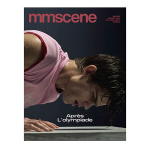
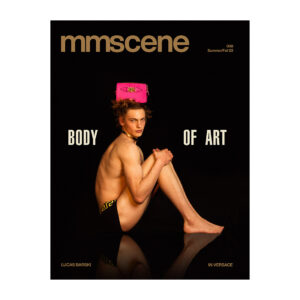
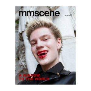
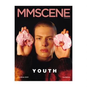
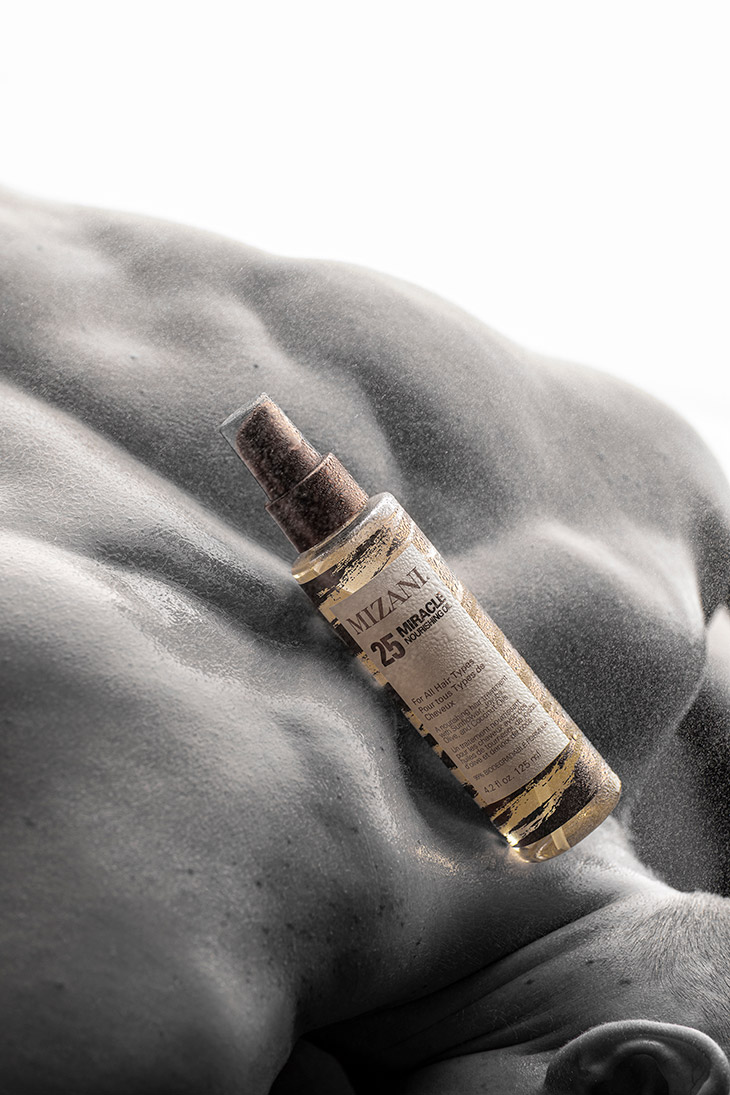
Images from MMSCENE PORTRAITS: Jarrod Vandergrifft by Jose Espaillat – See the full story here


