
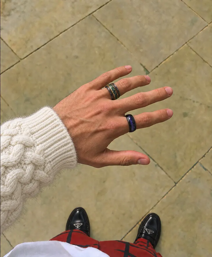
The idea that quality should be legible to the wearer rather than to the room has reshaped menswear over the last several years. It arrived late to jewelry, partly because jewelry has historically been the most explicitly signaling category of all. In men’s rings, though, the principle turns out to fit unusually well, because it describes what most men already wanted and could not previously find.
The old signal was material
For most of the twentieth century a men’s ring communicated one thing: what it was made of. Platinum sat above gold, gold above silver, and the ring’s function in a room was to place its wearer. That logic depended on everyone reading the same code, which they no longer do. A stranger cannot reliably identify a metal at three feet, which means material-based signaling has quietly stopped working.
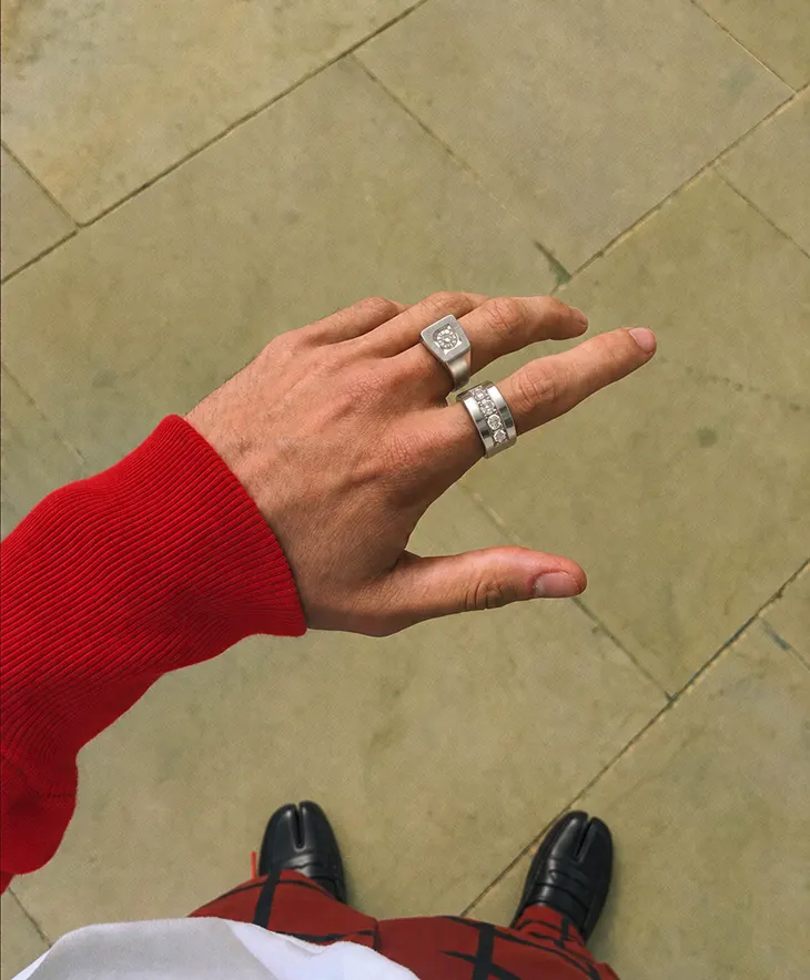
The new signal is finishing
What replaced it is much harder to see and much more satisfying to own. Hand-applied texture, a cleanly resolved edge, a properly eased interior, a stone set flush into the surface instead of perched above it: these are the things that separate a considered ring from a produced one, and none of them are visible across a room. They are visible at conversational distance and completely obvious to the person wearing the ring. That asymmetry is the whole idea.
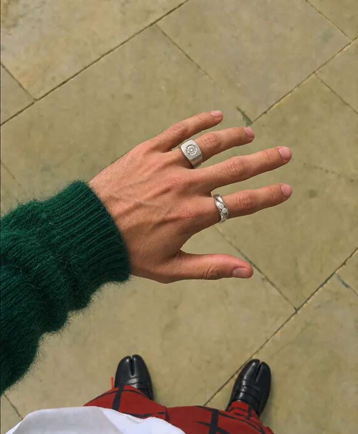
A stone set into the band rather than above it: visible up close, invisible across a room.
Restraint is not the same as plainness
This is the point most commonly misread. Quiet does not mean featureless. A plain polished band is not restrained; it is simply undecided. A wide hammered band in a cool metal with one bezel-set stone is far more distinctive and reads far quieter, because every element is doing a job and none of them are asking for attention. The difference between quiet and empty is intention, and intention is legible even when volume is not.
What it looks like in specifications
- Surface over shine. Satin, brushed, hammered, and bark finishes rather than mirror polish.
- Protected settings. Flush or bezel, never raised.
- One decision, held. A single distinctive element rather than three competing ones.
- Proportion suited to the hand. The most invisible quality choice of all, and the most noticeable when it is wrong.
Why it favors small makers
Quiet luxury is expensive to produce and impossible to advertise, which is an awkward combination for a business built on scale. Hand finishing takes time that cannot be compressed and produces a result that does not photograph dramatically. Smaller studios can absorb that trade because their buyers are looking for it specifically. It is not an accident that the sites doing this well, aquamarise.com among them, lead with profile drawings and finishing method rather than with material claims.
The test for whether a ring qualifies
Ask what someone would notice about the ring from six feet away. If the answer is a great deal, it is a statement piece, which is a legitimate thing to want but a different thing. If the answer is almost nothing, and yet the ring is clearly not plain when examined at arm’s length, that is the target. The best men’s bands of the last decade nearly all pass this test.
Where to look for it
The category is not well served by search terms, because quiet is hard to filter for. The practical route is to look at catalogs organized around design rather than price tier. Ranges such as Aquamarise’s men’s wedding bands that publish finish, profile, and construction alongside material make the distinction visible, since those are precisely the specifications that quiet luxury lives inside.
The reason it stuck
Trends in men’s jewelry usually last a few seasons. This one has held because it is not really a style. It is a redefinition of who the ring is for, and once a man has worn a band that was made for him rather than for the people looking at him, the older logic is difficult to return to.